
Why small text fails before the press even starts
When a job includes tiny lettering, thin rules or small registration marks, the screen has to hold detail before ink ever reaches the substrate. If the mesh is too open, too loose or not cleanly stretched, the print can spread, blur or close up on the finest parts. That is why small text jobs should begin with screen choice and tension, not with trial prints on the press.
In practical terms, the aim is to move enough ink for a solid mark while keeping the stencil edges sharp. On a simple two-colour job with fine captions for packaging or a label panel, a screen that works for bold artwork may be too coarse. The same goes for a frame that has tired corners, uneven tension or old ink build-up along the edges. Those faults show up fast on small type.
- Choose mesh count for the smallest detail in the artwork, not the biggest area.
- Check that the frame is flat and free of twist before exposing or reclaiming.
- Look for even tension across the whole screen, not only in the centre.
Mesh count choices that suit fine lettering
Mesh count needs to match the detail level and the ink system being used. For small text, a finer mesh usually gives better control because it supports sharper stencil edges and limits excess ink deposit. That does not mean every fine job needs the finest mesh on hand. You still need enough ink flow for proper coverage, especially on white shirts, coated boards or darker backgrounds where the print has to hold its shape.
A sensible approach is to match the mesh count to the thinnest line or smallest font size in the artwork. For very fine copy, specialist printers often move to higher mesh counts and tighten their reclaim process so the screen opens cleanly. For slightly larger small text, a mid to fine mesh can still give a strong result if the tension is good and the squeegee stroke is controlled.
- Use finer mesh for small serif fonts, micro text and narrow strokes.
- Use a slightly lower count when the job needs more ink deposit for opacity.
- Keep one screen set aside for repeat small-text work so the setup stays consistent.
Tension is what keeps the letters crisp
Even with the right mesh count, poor tension can ruin a small text print. Loose mesh bounces under the squeegee and lets the stencil edges move during the print stroke. That is when a letter loses its corners or starts to look fuzzy. Proper tension gives a clean snap back after each pass, so the mesh releases ink in a controlled way.
For screen printers working in Germiston, Johannesburg or Pretoria, humidity and storage conditions can affect how a screen behaves from one day to the next. In coastal areas like Durban and Gqeberha, the air can add another layer of pressure on screen condition, especially if the screens are stored in a hot room or stacked too close together. If the screen was stretched well and checked before dispatch, it is far easier to keep registration tight on press.
- Check tension before every fine-detail run, not only when the frame is new.
- Watch for slack corners, uneven bounce or a screen that drags on the off-contact.
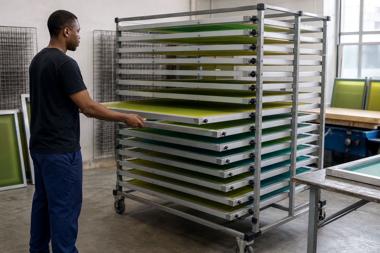
- Keep screens stored upright and dry so tension does not shift unnecessarily.
Frame prep and stretching details that pay off
Good small text printing starts with a frame that has been cleaned properly and stretched evenly. Aluminium frames are a practical choice for repeat work because they keep their shape better than worn timber and are easier to control during pre-stretching. Clean prep matters too. Any glue residue, old emulsion or edge contamination can create weak points that affect the print area closest to the artwork.
When a frame is re-stretched or made to a custom size, the goal is not only to hold mesh. It is to keep the mesh even across the full image area and give the printer a stable surface for exposure and print work. That matters on jobs with small type because the pressure of the squeegee is unforgiving. A frame that is straight, properly bonded and checked for corner strength will give more repeatable results on short runs and reorders.
- Use custom frame sizing when the artwork sits close to the edge of the design area.
- Ask for frame clean prep before stretching if the screen is being reused.
- Make sure the bond line is tidy so the mesh stays secure during press pressure.
Artwork checks that save time on press
Many small text problems begin with artwork that looks fine on a monitor but is too tight for screen printing. Thin fonts, reversed text, tiny spacing between letters and very light rule lines all need a careful check before the screen is exposed. If the copy is too small for the selected mesh, the print will fight the screen all the way through the run.
It helps to separate jobs into two groups: artwork that can print cleanly with a standard fine mesh, and artwork that needs special handling. That might mean changing the mesh count, adjusting the stencil, or advising the customer to open the letter spacing slightly. A quick screen inspection before the run can catch a bridge in the emulsion, a weak corner or a stray mark that would be hard to see once the press is moving.
- Check line weight, font size and spacing before exposing the screen.
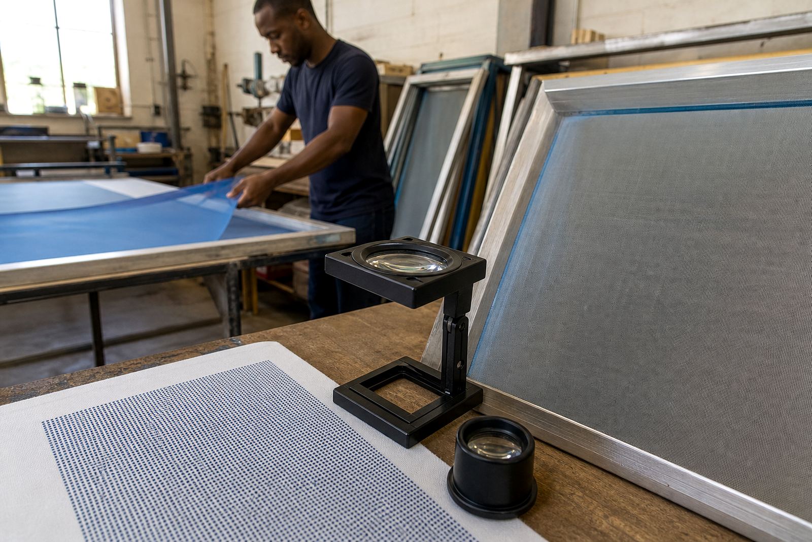
- Inspect the screen under strong light for pinholes and blocked areas.
- Confirm the image sits comfortably inside the print area with room for tape and margins.
A local example from a repeat packaging run
A print shop in the East Rand may have a repeat order for small batch carton sleeves with batch numbers, ingredient notes and a narrow logo line. The artwork is not large, but it is unforgiving. If the screen is too open the type closes up. If the tension is off, the number line starts to blur by the middle of the run. In a case like this, the best result usually comes from a fine mesh screen, careful tension checking and a clean setup before the first print.
For repeat work, consistency matters more than speed. A screen that was matched properly the first time can be kept ready for future runs, which helps when the client needs the same detail again next month. That is where repeat order service and screen setup advice are useful, because the printer is not starting from scratch each time and the fine text stays closer to the approved sample.
- Keep a note of the mesh count used on each successful small-text job.
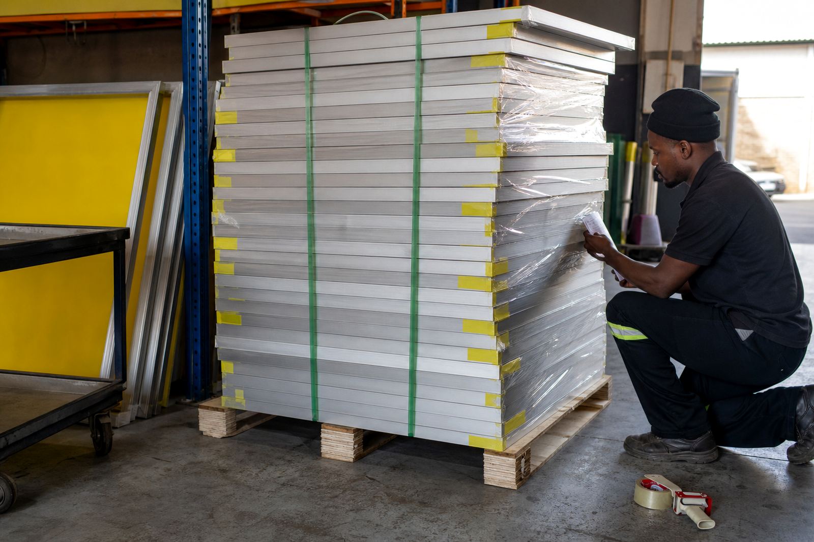
- Store approved screens safely for repeat production when possible.
- Recheck tension before every rerun, especially after transport or storage.
How MeshMaster supports small text work
For print shops across Johannesburg, Pretoria, Durban, Cape Town and Gqeberha, the useful part is having screens prepared for the kind of work that needs accuracy. That includes new frame stretching, frame re-stretching, mesh count matching, tension checking and batch screen prep. When the screen is ready before it reaches the press, the printer can spend less time fixing avoidable faults and more time keeping the job clean.
Small text printing does not forgive shortcuts. The right mesh, a properly stretched frame and a careful inspection can turn a difficult job into a predictable one. Whether the run is for packaging, labels or fine copy on a promotional item, the screen should support the detail, not fight it. That practical approach saves time, reduces waste and keeps the final print readable where it matters most.