
Why poster prints need a different mesh approach
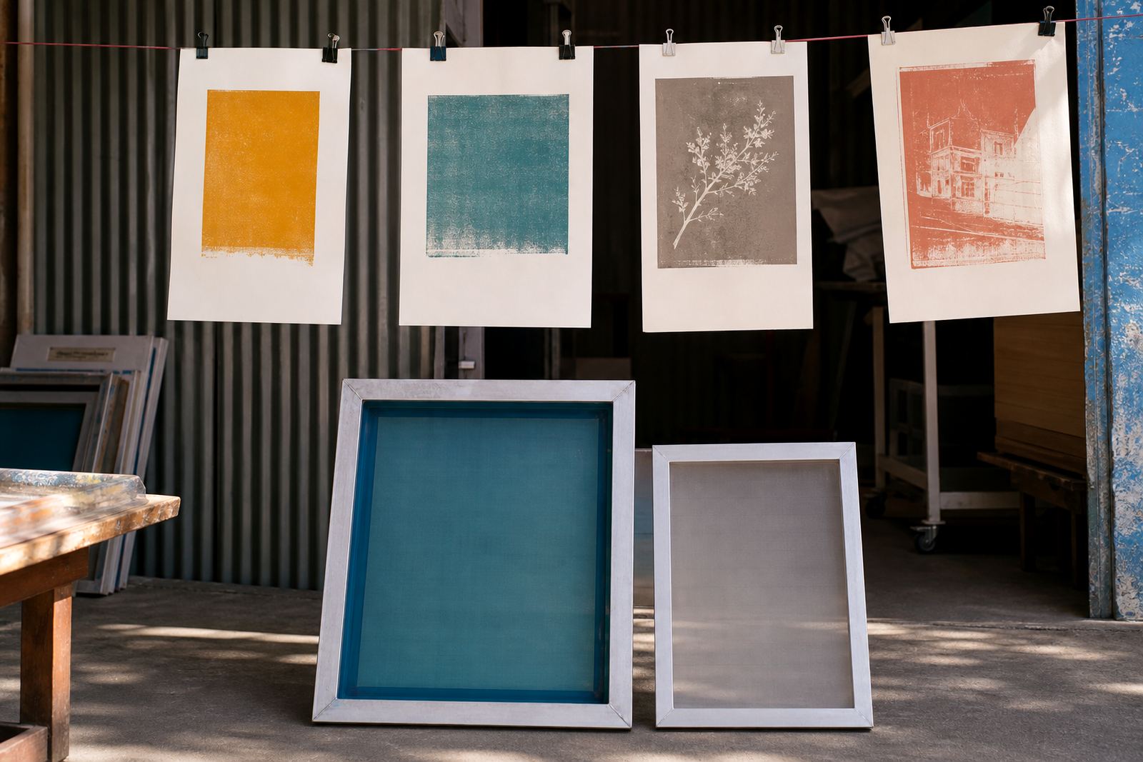
Posters usually mix solid colour areas with type, fine lines and sometimes halftones. That means the screen has to handle both ink deposit and detail retention. A mesh that is too open can flood the print and make small text close up, while a mesh that is too fine can starve the image and leave flats looking patchy. For poster production, the aim is balance.
In practice, most print shops in Germiston, Johannesburg or Pretoria will choose the mesh after looking at the artwork, the ink type and the substrate. Paper posters often call for a different setup than synthetic stock or board. If the poster is going out for indoor use, you may want cleaner detail and a lighter ink layer. If it must stand up to handling or slight moisture, the setup may shift a bit toward stronger ink coverage.
It also helps to think about the finish the client expects. Matte artwork, bright advertising posters and short-run event prints do not all behave the same. One mesh count wont suit every job.
Choosing mesh counts for bold areas and fine type
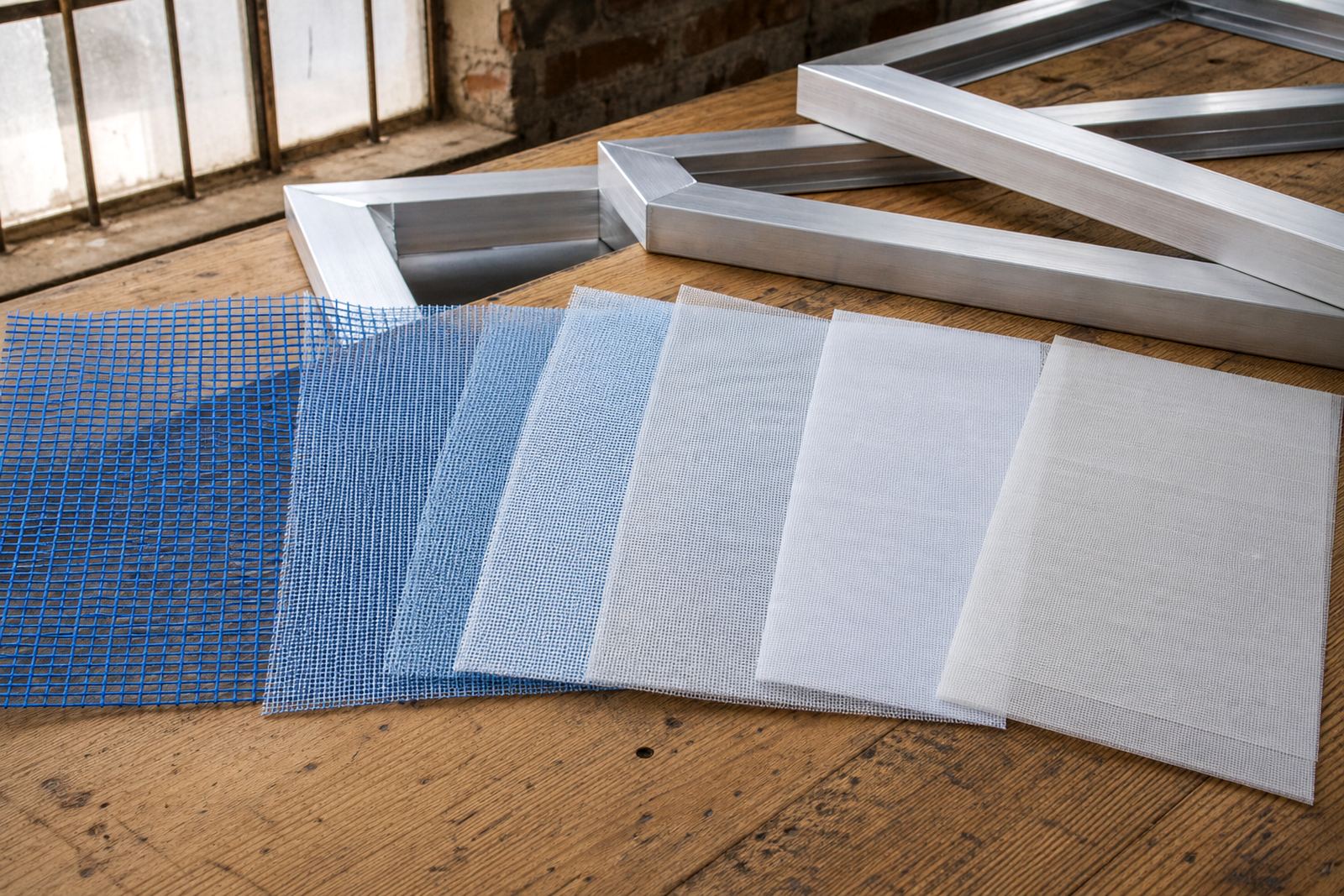
Mesh count is one of the first decisions in poster screen work. Lower mesh counts allow more ink through and suit heavy colour blocks, large titles and spot colours. Higher mesh counts support finer detail, smaller lettering and cleaner edges. Many poster jobs sit in the middle ground, where the printer needs enough deposit for strong colour but still wants sharp type.
As a practical rule, a shop should match the mesh to the smallest detail in the artwork. If the poster carries thin rules, small sans serif text or subtle halftones, a finer mesh is usually safer. If the design is simple and the colour needs to cover well on a light or porous stock, a medium mesh may be better. The key is not to force one screen to do everything.
- Lower mesh counts are useful for bold graphics, large headings and stronger ink laydown.
- Medium mesh counts suit general poster work with mixed solids and type.
- Finer mesh counts help with detailed imagery, small text and cleaner halftones.
- Very open mesh can over-ink paper and reduce edge sharpness.
- Very fine mesh can slow the print and need closer control of squeegee pressure.
For poster runs across Cape Town, Durban or Gqeberha, where humidity can change how inks behave, the same artwork may need a small adjustment to mesh choice and print speed.
Frame tension and why it matters on long poster runs
Even with the correct mesh count, poor tension can spoil poster output. A screen that sags or feels uneven will often show banding, blurry edges or inconsistent ink release across the image. Good tension gives a cleaner snap-off from the substrate and helps the squeegee keep a steady print angle.
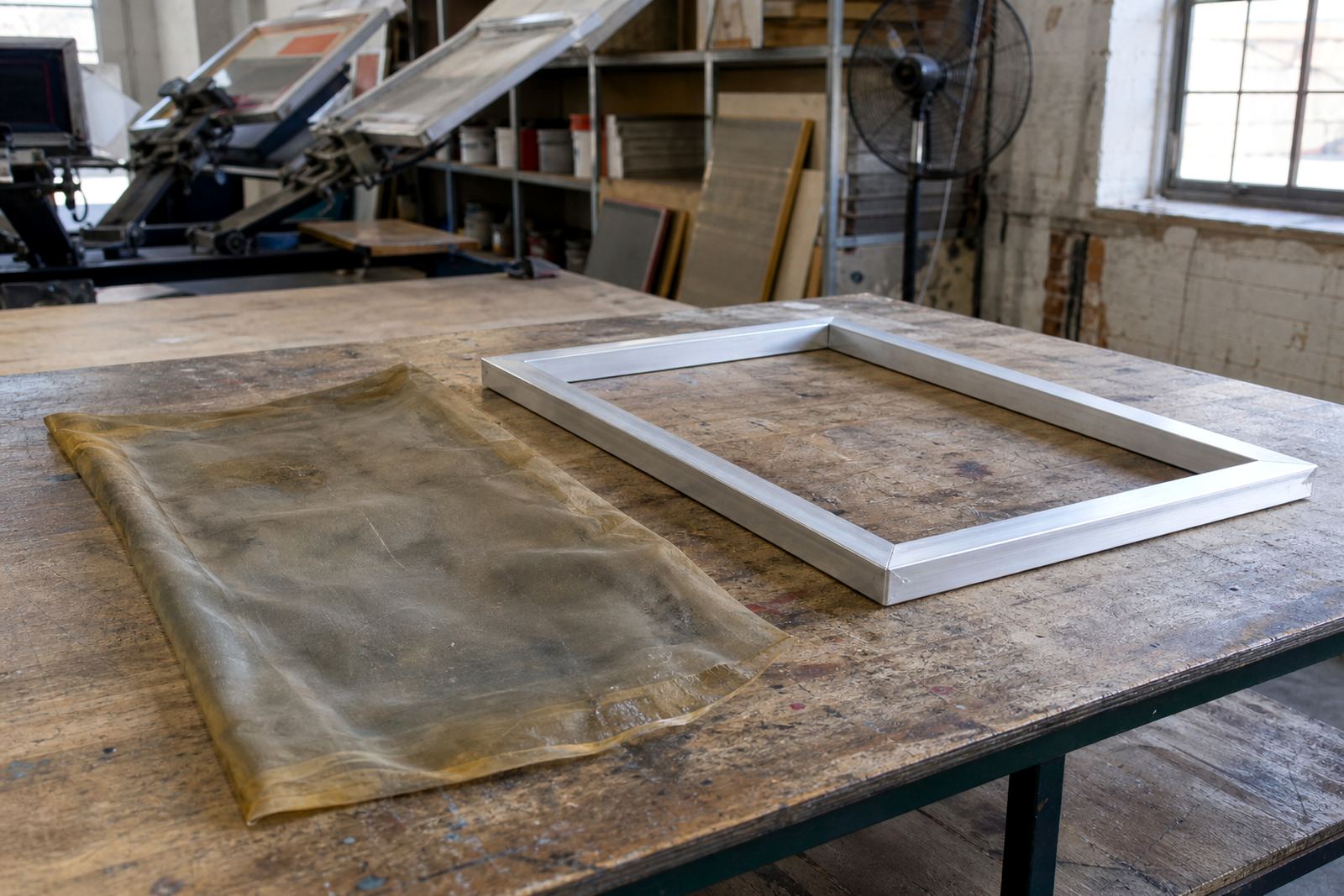
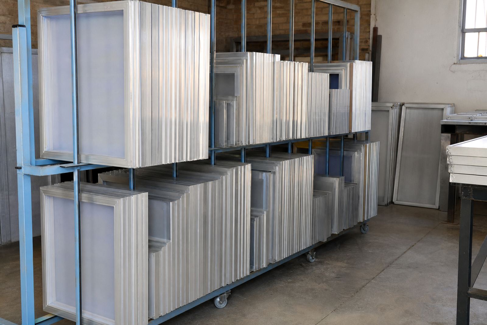
Pre-stretched aluminium frames are often preferred for poster work because they hold tension more reliably than a frame that has been used too many times without proper recovery. They also help when a shop is handling repeat orders and wants the same result from one batch to the next. For a poster campaign, consistency matters as much as first-pass quality.
When tension drops, the printer may start compensating with more pressure, but that usually creates a different problem. Too much pressure can flood the image and push ink beyond the edge of fine lines. Better tension means less chasing during the run.
- Check tension before the run, not after the first few prints.
- Watch for uneven corners and weak areas near the frame edges.
- Use the same frame size and setup for repeat poster orders where possible.
- Re-stretching can be a practical option if the frame is still sound.
Mesh choice for paper, board and coated poster stock
Poster material changes the way mesh behaves. On uncoated paper, ink can sink in quickly so the printer may need a setup that gives enough deposit without overworking the sheet. On coated stock, the surface may hold detail better but can also demand cleaner release and better drying control. Board and thicker poster material often need a stable screen and steady ink flow to avoid build-up.
Screen preparation becomes important here. A clean frame, properly bonded mesh and a well-inspected stencil help keep the print consistent from start to finish. Dust, old ink residue and uneven emulsion edges are common causes of trouble in poster production, especially when a job needs crisp text and flat colour across a wide area.
Load-shedding can also affect poster work in a very practical way. If drying takes longer, print shops need to think about handling time, stacking space and whether the chosen mesh is delivering a heavier-than-needed ink layer. In a busy shop, that sort of planning saves rework later.
Local print shop realities in Gauteng and beyond
A Germiston shop doing poster work for clients in Johannesburg and Midrand may be turning jobs around in tight windows. The same is true for print shops supplying Pretoria, Durban or Cape Town events, where artwork often changes late and delivery timing is fixed. In that kind of setup, the screen has to be predictable, easy to repeat and quick to inspect.
For a poster run, practical decisions matter more than theory. A shop will often prepare a few screens for the likely artwork range, then match the mesh count to the detail level before the order goes live. That is where mesh count matching and tension checking earn their place. It reduces the risk of one screen being pushed into a job it cannot handle properly.
A common local example is an event poster with a large logo, small venue text and a bright background. The logo might print well on a medium mesh, but the fine venue details may need a finer setup. If the shop is doing batch screen prep and repeat order service, it is easier to keep a note of what worked last time and use the same setup again.
A practical checklist before you print posters
Before a poster job goes onto press, it pays to go through a short check. This keeps the job moving and helps the print hold together across the full run. It is especially useful when the order includes several sizes or when the artwork has both bold and fine elements.
- Confirm the smallest detail in the artwork so the mesh count is not too open.
- Check screen tension on all sides, not just one point.
- Inspect the stencil for clean edges and no pinholes.
- Make sure the frame is clean and free from dried ink or old adhesive.
- Match the screen to the stock being used, especially for coated or uncoated poster paper.
- Keep the setup notes for repeat work so the next run starts from a known point.
When those basics are in place, poster printing becomes much easier to control. The result is a cleaner image, steadier colour and less time spent correcting problems on press.
When to ask for help with mesh and frame setup
Some poster jobs are straightforward, but others need a second look before the screen is stretched or reused. If a design includes fine type, layered colours or unusual stock, it helps to get the mesh count and frame setup checked first. That is often the difference between a screen that looks fine on the bench and one that performs properly on press.
MeshMaster supports print shops with new frame stretching, frame re-stretching, mesh count matching, tension checking, frame clean prep, mesh bonding, custom frame sizing, batch screen prep, screen inspection, dispatch packing, repeat order service and screen setup advice. For poster production, that kind of support is useful when a shop wants dependable screens for local and national work alike.
For print shops across South Africa, especially where deadlines are tight and paper stock changes from job to job, the screen should be chosen with care. Poster work rewards a setup that is calm, consistent and matched to the artwork from the start.