
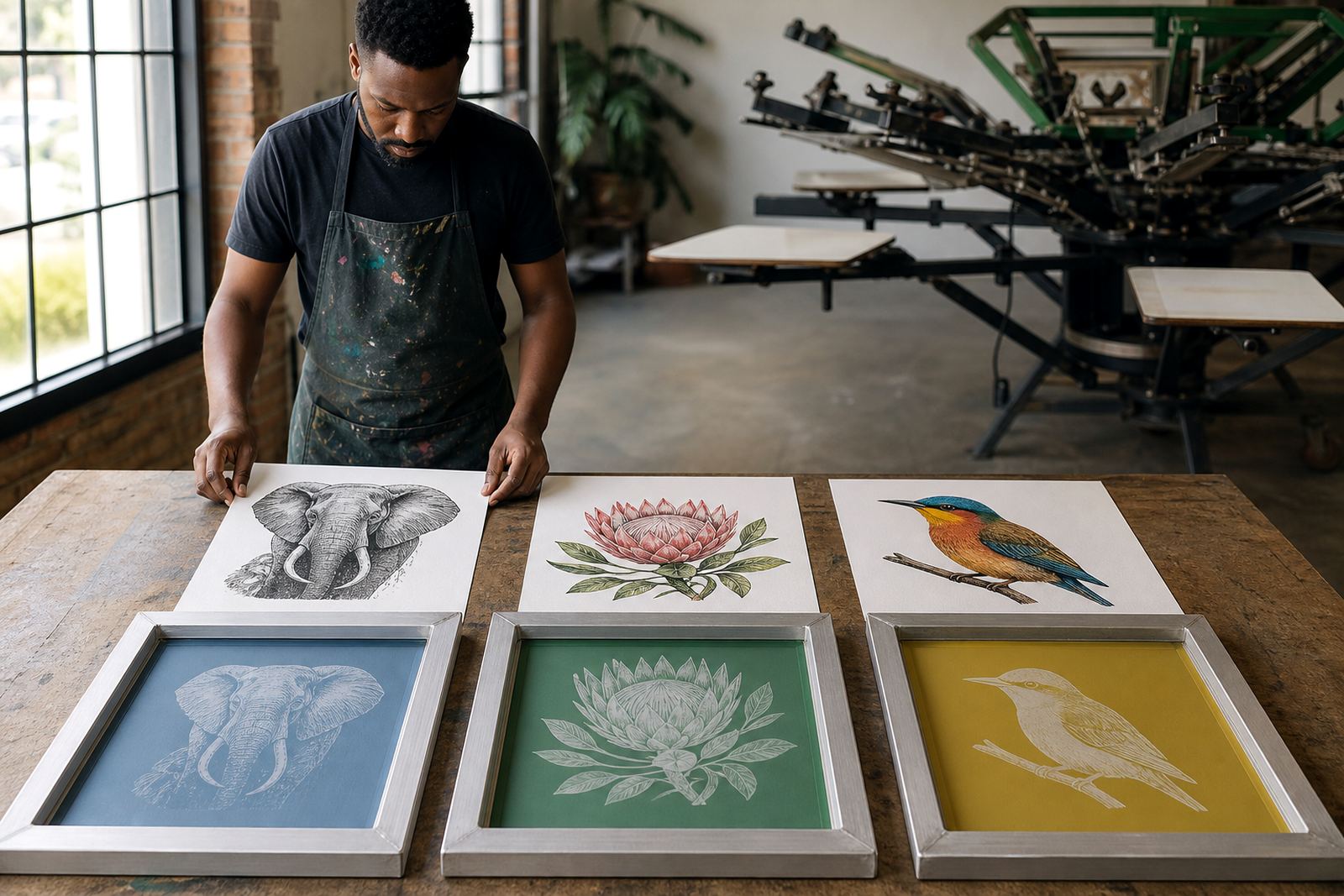
Why mesh count and artwork scale must work together
Screen mesh count is about control. A lower count lets more ink through, which suits bold graphics, block letters and heavy coverage. A higher count holds back more ink and gives better definition on fine lines, small type and detailed artwork. The right choice depends on the image, the ink, and the fabric or substrate being printed.
When artwork is scaled up or down, the smallest details change with it. A logo that looks fine on a computer screen can become difficult to print if the mesh opening is too open for the line weight. On the other hand, very fine mesh on a simple one colour job can leave the print looking thin and underfed. In practice, mesh selection is part of prepress, not just a frame choice.
Using lower mesh counts for bold colour and solid coverage
For large blocks, strong spot colours and bold graphics, printers often work with lower mesh counts because they allow better ink deposit. That helps on jobs where you want full opacity, especially on darker garments or where a plastisol style ink, or thicker water based ink, needs room to pass cleanly through the screen.
These mesh choices are common when the artwork is simple and the client wants impact over fine detail. On a shop floor in Germiston or Midrand, that might mean a clean logo on workwear, signage panels or event shirts where the image is supposed to read from across the room.
- Good for large solid areas and simple shapes
- Helps with thicker ink deposits
- Useful where opacity matters more than tiny detail
- Best when the artwork has few fine lines
When medium mesh counts give the safest balance
Medium mesh counts are often the working range for general screen-printing because they sit between coverage and detail. They suit artwork with mixed elements such as logos, text and mid level line work. If the image includes both solid blocks and smaller features, this range usually gives a practical result without overcomplicating setup.
For many South African print shops, this is the count range that gets used most often for repeat jobs. It handles a wide mix of artwork sizes and it gives enough flexibility for different inks and fabrics. The key is to match the mesh to the finest part of the design, not only the largest shape.
- Useful for mixed artwork with text and logos
- Works well for general production and repeat orders
- Offers a balance of detail and ink flow
- Often chosen when one screen has to do several jobs
Fine detail needs tighter mesh and cleaner preparation
Refined artwork needs a tighter mesh because small text, thin lines and halftones can blur if the mesh is too open. As the mesh count rises, the print becomes more controlled and the stencil holds finer features better. That does not mean every detailed job needs the highest possible count. It means the mesh should support the smallest part of the design while still allowing the ink system to perform properly.
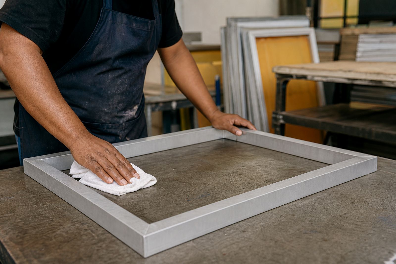
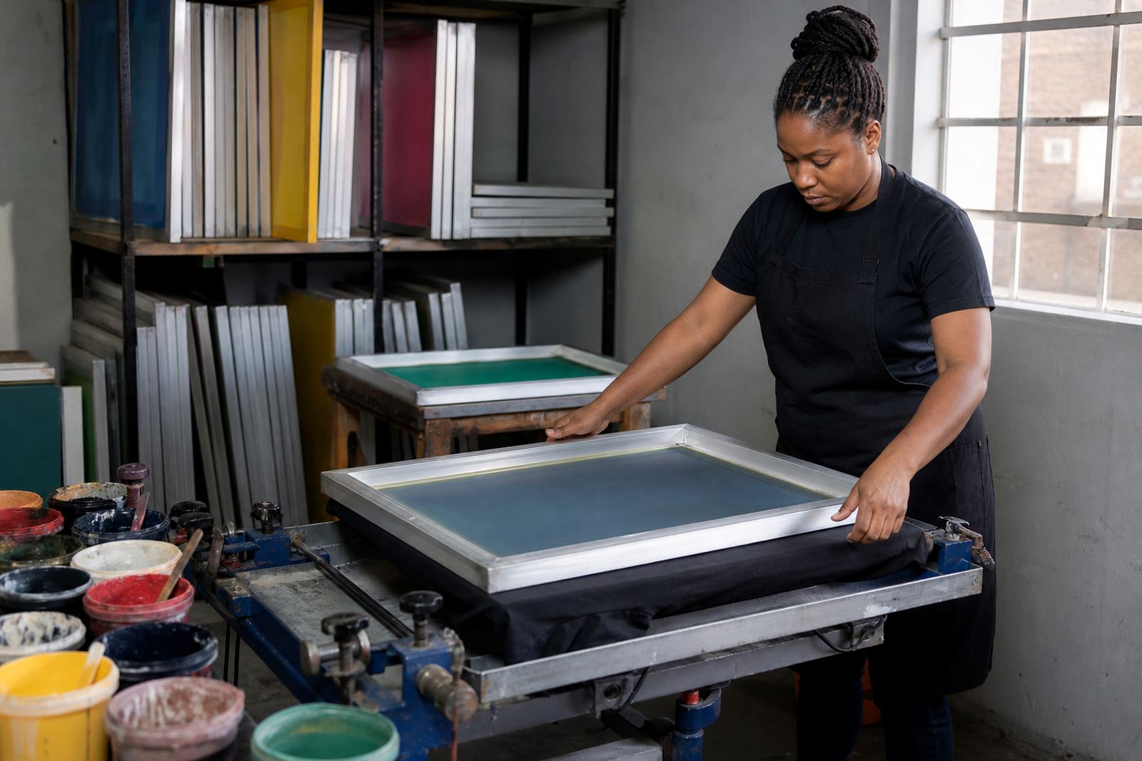
Clean screen prep matters here as well. If the mesh is not properly cleaned, degreased and checked for damage, fine detail can fail even when the count is correct. A tiny pinhole, poor tension or uneven exposure can show up fast on fine work. That is why tension checking and screen inspection are part of solid production discipline, not extra steps.
- Best for small lettering and thin rules
- Helps keep halftones clean and controlled
- Needs even tension across the frame
- Depends on careful exposure and prep
Why pre-stretched aluminium frames improve repeat work
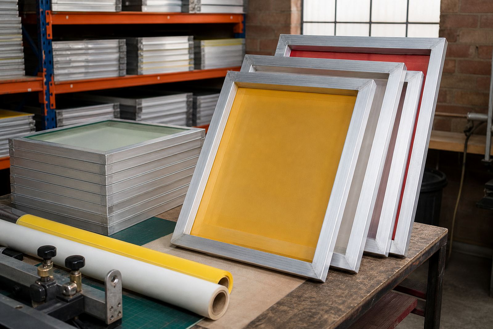
Pre-stretched aluminium frames help keep mesh tension more consistent, which is important when a shop is repeating the same job over and over. A stable frame gives better registration, steadier print feel and fewer surprises when the artwork must line up across multiple colours. In humid coastal areas such as Durban, stable frame construction also helps reduce movement from changing weather.
For printers working in Johannesburg, Pretoria or Gqeberha, the benefit is the same: predictable screens that are ready for setup and less time spent correcting tension issues on press. When frames are stretched properly and checked before dispatch, the printer can focus on registration and artwork, not on fighting the screen.
- Improves consistency from one run to the next
- Supports better registration on multi colour work
- Useful for repeat orders and batch screen prep
- Helps reduce rework caused by loose mesh
A local example from a busy print shop
A print shop in the East Rand might receive three jobs in the same week: a bold promotional tee, a mid detail staff shirt, and a refined event logo with small type. Using one mesh count for all three would be a compromise. The bold tee could print fine, but the detailed logo might fill in, while the small type could lose sharpness.
By matching mesh count to artwork scale, the shop can separate those jobs properly. The bold work gets a lower count, the mixed artwork gets a medium count and the fine detail gets a tighter mesh with careful tension control. That saves time during setup and helps keep the final prints consistent across the order. For many shops, that consistency is what keeps repeat customers coming back.
It also helps when stock turns over quickly. If the screens are cleaned, inspected and packed for dispatch properly, the next run starts faster and the printer does not have to guess which screen was used last time.
What to check before you choose mesh for a job
Before selecting a mesh count, look at the smallest detail in the artwork, the ink you plan to use and the surface you are printing on. Also check whether the job needs a heavy deposit or a fine finish. A good mesh choice starts with the print result you want, not only the screen size you have on hand.
For South African shops dealing with load shedding, tight turnaround times and mixed order books, it helps to keep a sensible range of mesh options ready for use. That way one job can move from artwork review to screen setup without delays. The right mesh choice is a practical decision, and when it is matched well the print shows it immediately.
- Check the finest detail in the artwork
- Match mesh count to ink thickness
- Consider the garment or substrate surface
- Keep screens ready for repeat jobs and quick turnarounds
Need the right mesh for your next run?
If you are working on bold graphics, medium detail or refined artwork, the best screen starts with the right mesh and a properly stretched frame. That makes setup easier and helps each print hold its shape from the first pull to the last.
For print shops across Germiston, Johannesburg, Pretoria, Durban, Cape Town and Gqeberha, reliable mesh matching and frame preparation can save time on press and reduce waste. When the screen is prepared properly, the artwork has a better chance of printing the way it was meant to print.